Simplifying Inventory Management Processes for Construction Junction Staff
Overview
Who is CJ?
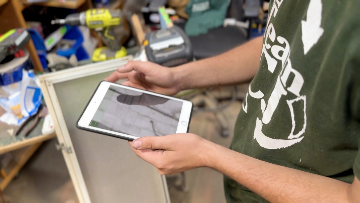
CJ is a 26 year old, local Pittsburgh nonprofit that gives building materials a second life through affordable resale. Every donated item must be evaluated, priced, photographed, and entered into inventory before reaching customers, making inventory quality foundational to both operations and digital engagement.
Construction Junction (CJ) partnered with Carnegie Mellon University's Master of Human-Computer Interaction (MHCI) program to strengthen its digital experience and better engage younger audiences. After seven months of research and prototyping, our team found the biggest opportunity lay not in customer-facing technology, but in improving inventory quality at its source. This led to three complementary solutions that address upstream inventory challenges and ultimately improving the customer experience.
My Role
Throughout the project, I acted as the Lead Product Manager for the team. We began in January
Project Metrics
increase in conversion events
increase in organic search sessions
increase in organic engagement rate
The Problem
Staff have no time to make important decisions…
The project began with a broad challenge: better engage younger audiences, improve customer experience, and support Construction Junction's long-term growth. Through interviews, contextual inquiries, and workflow observations, we discovered the customer experience starts at intake. The quality of online listings, pricing, and product discovery all depended on the quality of information captured there. Rather than adding more technology, we focused on simplifying workflows, improving accessibility, and supporting staff expertise.

"We're getting slammed with pallets of donations…I need to get this item in now, like right now. There's no time to even make a second judgment call."
– Construction Junction Dock Coordinator
Our Approach
CJ's Ecosystem
Construction Junction's inventory process spans multiple roles, systems, and customer touchpoints, so no single research method could capture the full experience. Working alongside staff, leadership, and technical partners, our team combined contextual inquiry, stakeholder interviews, workflow analysis, iterative prototyping, and design validation to understand upstream workflows and collaboratively develop future solutions.

What I learned
01
SPPI was missing industry standard features.
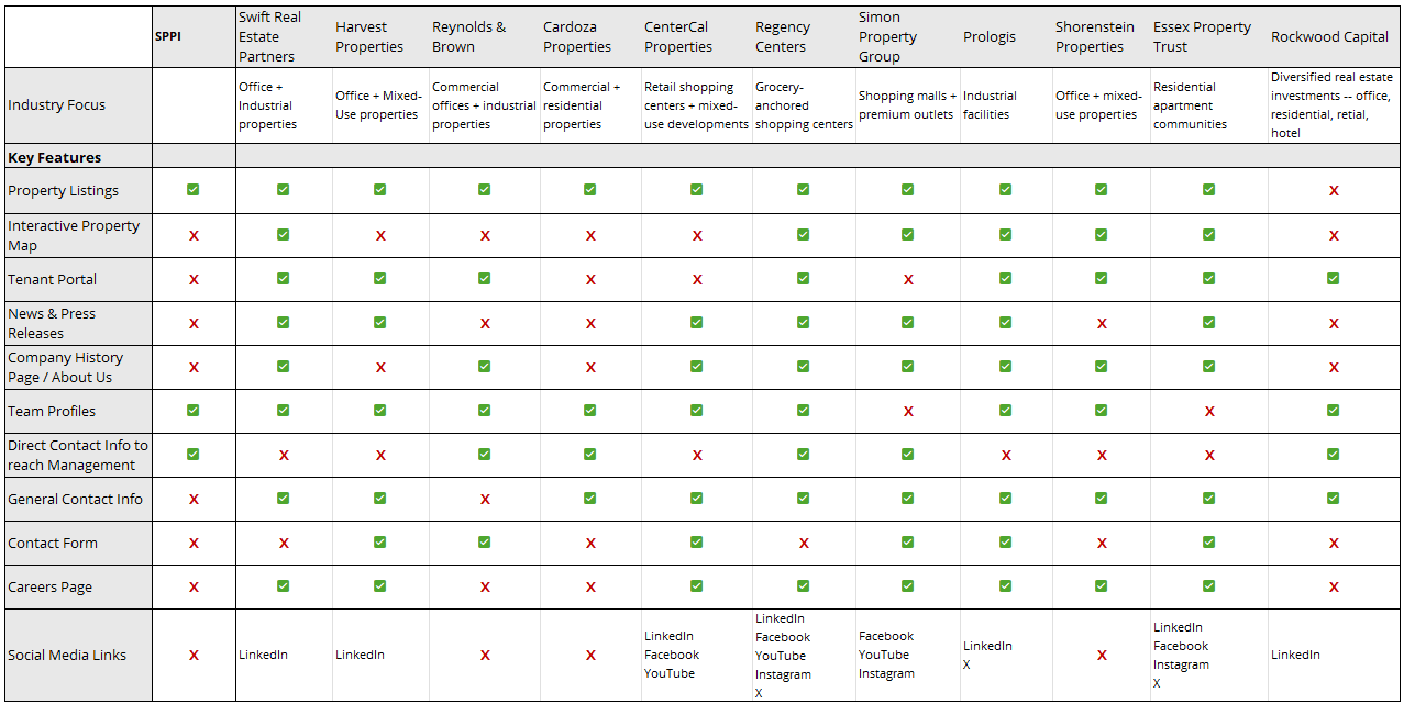
9 of 11 competitors offered interactive property maps, 8 had news sections, and 7 had careers pages. SPPI offered none of them despite managing a large commercial portfolio.
02
We couldn’t measure success.
The site had no analytics, conversion tracking, or SEO infrastructure, making it impossible to understand visitor behavior or business impact.
03
Budget constraints led the strategy
Leadership wanted dedicated pages for every property, but vendor solutions couldn’t support that vision affordably.
Design Decisions

01
Interactive Property Map
I designed an interactive portfolio map that allowed users to explore office, retail, industrial, and residential properties geographically.


02
Scalable Property Landing Pages
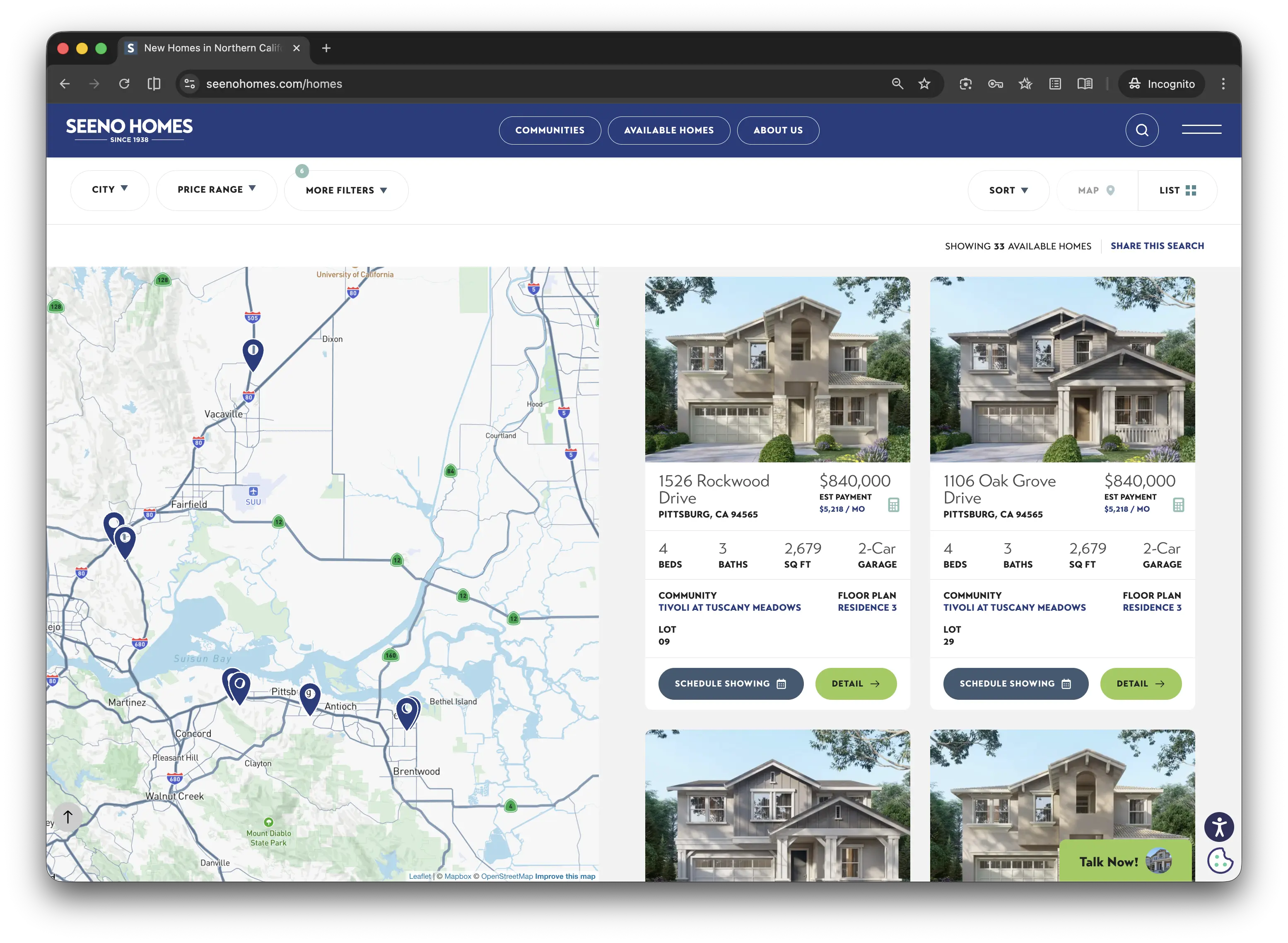
I created a reusable landing page system that could support 33 property pages while maintaining consistency and reducing development costs.
03
Direct Contact Pathways
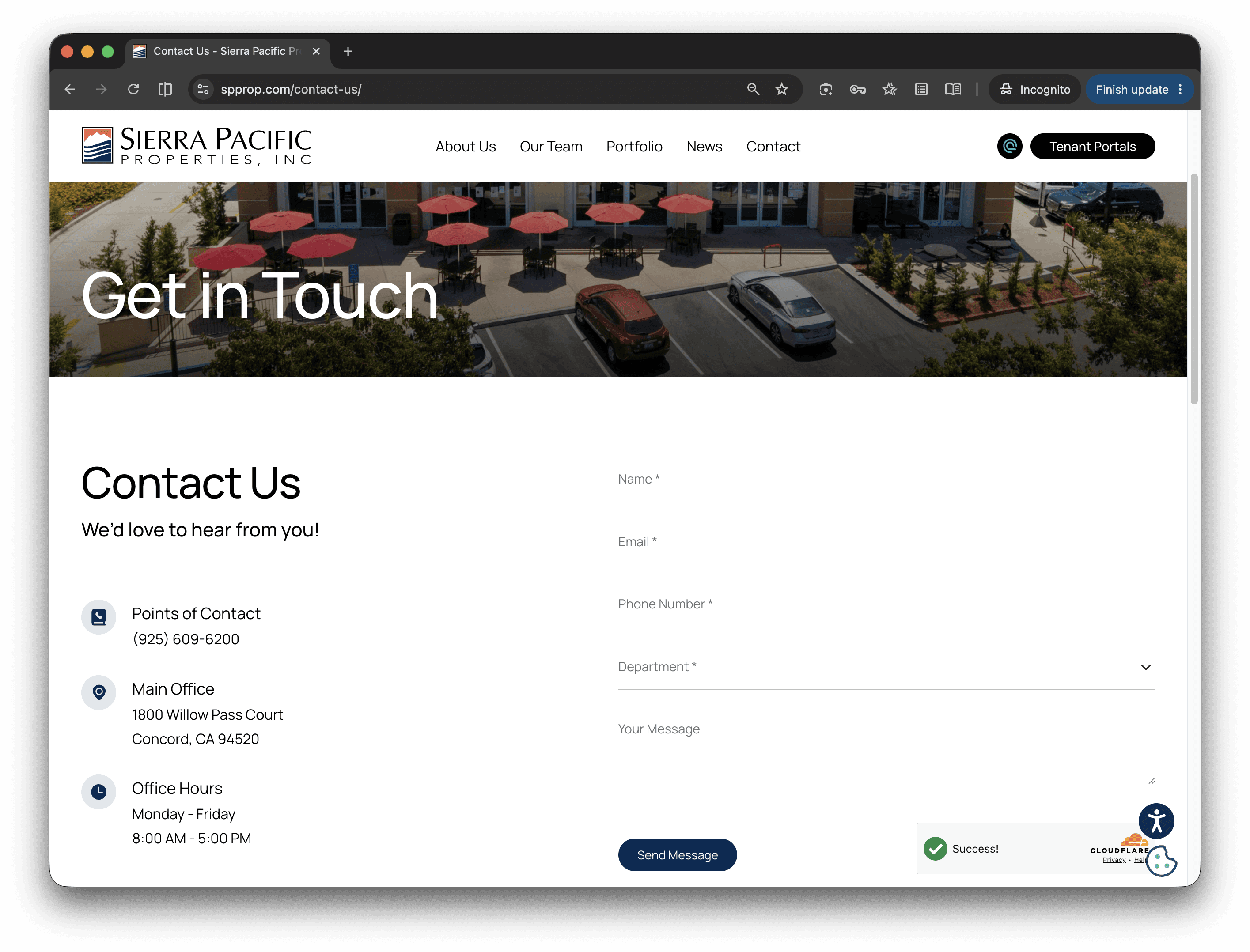
I introduced dedicated department contacts, contact forms, and clear pathways to reach the right team.
Information Architecture
The final website was shaped by information architecture.
Before any design work, I audited 11 competitor websites across 12 feature categories from local Bay Area property managers to large REITs like Prologis and Simon Property Group.
CHALLENGE
The existing website had no clear structure: four flat pages, no dedicated property pages, and no intuitive path for prospective tenants to find space, learn about the company, or contact the right team.


DECISION
I rebuilt the information architecture around tenant goals rather than internal departments, expanding the site from four flat pages into six structured navigation areas with dedicated pages for properties, team members, news, careers, and contact information.
CHALLENGE 02
I had time to lead the design, but not to see development through to the end. Knowing I'd be departing by summer, I had to choose where to put my energy. Designing the site myself and handing it to a vendor to build and maintain was the only approach that made sense given the timeline, and the only one that didn't leave the company dependent on me once I was gone.
DECISION 02
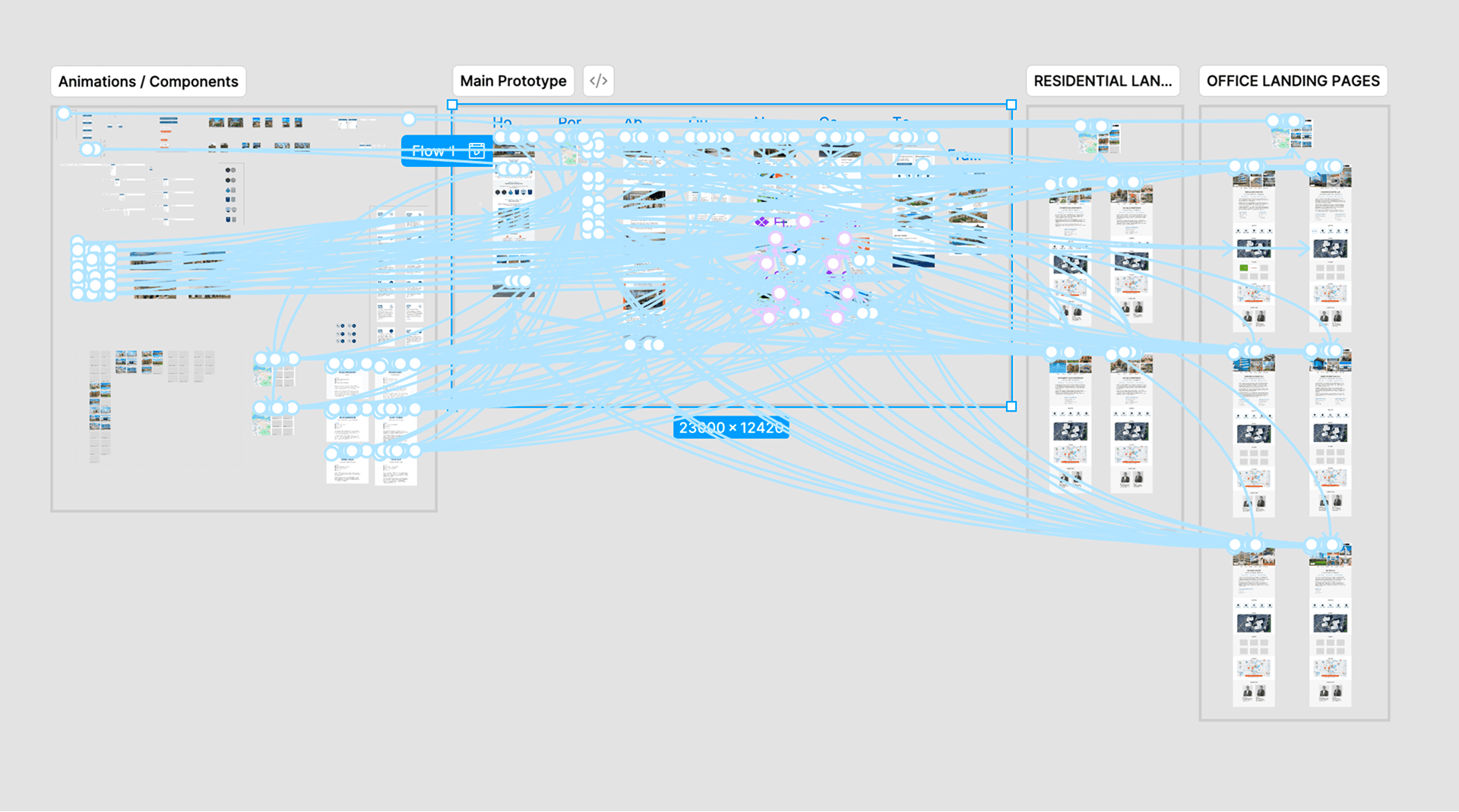
I designed the full website in Figma before vendor selection, creating interactive prototypes and reusable page templates. The prototype aligned stakeholders, clarified requirements, and became the single source of truth for implementation.
Reflections
This was the first project where I felt fully responsible for the outcome. I experienced the excitement of defining a vision, the uncertainty that comes with navigating competing stakeholder opinions, and the satisfaction of seeing something launch that genuinely impacted the business.
The biggest lesson I took away is that product management isn’t about having the perfect idea, it’s about making thoughtful decisions within real-world constraints. Every major decision on this project involved balancing user needs, business goals, technical limitations, budget, and timeline. Learning how to navigate those tradeoffs ultimately mattered more than any individual design decision.
By the end of the project, I was thinking in terms of systems, ownership, and how to create solutions that could succeed after my involvement ended.
What Others Said
"Elise was able to expertly integrate stakeholder visions, technical considerations, and work as the intermediary driving the development team to ensure that the resulting product not only met but exceeded the designs aspirations of everyone involved…She is exceptionally motivated, endlessly curious, and ultimately committed to the possibility of technology as a tool to improve human experience."
— Sr. Systems Engineer & Administrator, The Seeno Companies
Modernizing an Outdated Digital Presence for Sierra Pacific Properties
Building what’s next for Construction Junction
Sierra Pacific Properties (SPPI) does it all. They are a developer, owner, and operator of commercial real estate in the East Bay, spread across office buildings, business parks, shopping centers, and multi-family residential communities. With nearly four decades of presence in the Concord and Solano County markets, the company's community presence was strong, however they lacked any real online presence.
My Role
When I first joined the project, their website consisted of a stripped down home page and outdated HTML pages displaying their contact page and property categories. Their portfolio pages were outdated and had inaccurate information displayed. The goal I was positioned with taking over, was to redesign the SPPI website to position the company as a reliable, legitimate, and trustworthy presence in the Northern California commercial property market.
Project Metrics
+1,214%
Conversion Events
+111%
Organic Search Sessions
+68%
Organic Engagement Rate
+1,214%
Conversion Events
+111%
Organic Search Sessions
+68%
Organic Engagement Rate
increase in conversion events
increase in organic search sessions
increase in organic engagement rate
FINDINGS
SeenoHomes data flow between platforms.
TECHNICAL
Legacy systems
Internal sales data had never been integrated into a public-facing platform. Four separate systems needed to talk to each other for the first time.
LEGAL
Compliance requirements
California privacy laws and ADA accessibility standards were non-negotiable constraints that shaped every design and data decision.
Multiple stakeholders
Sales, marketing, and executive leadership all had a seat at the table with different priorities, timelines, and opinions on how the site should work.
ORGANIZATIONAL
Analytics review of current traffic and user behavior
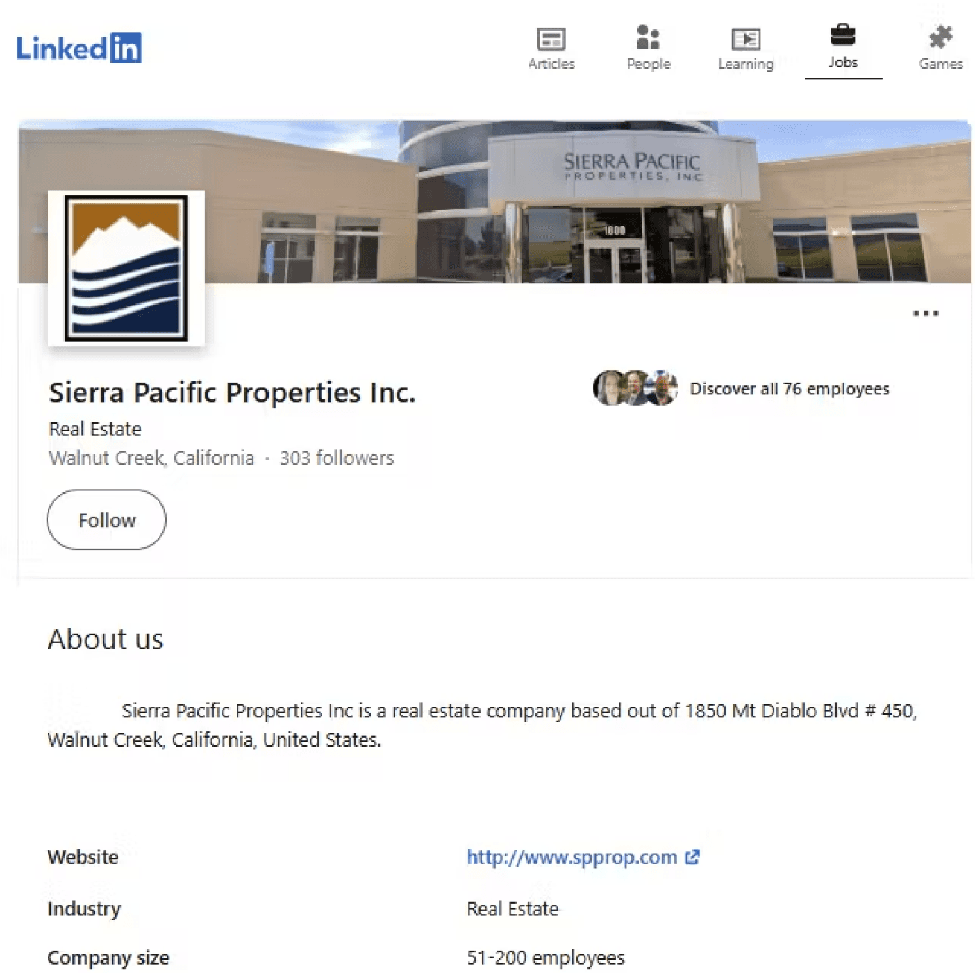
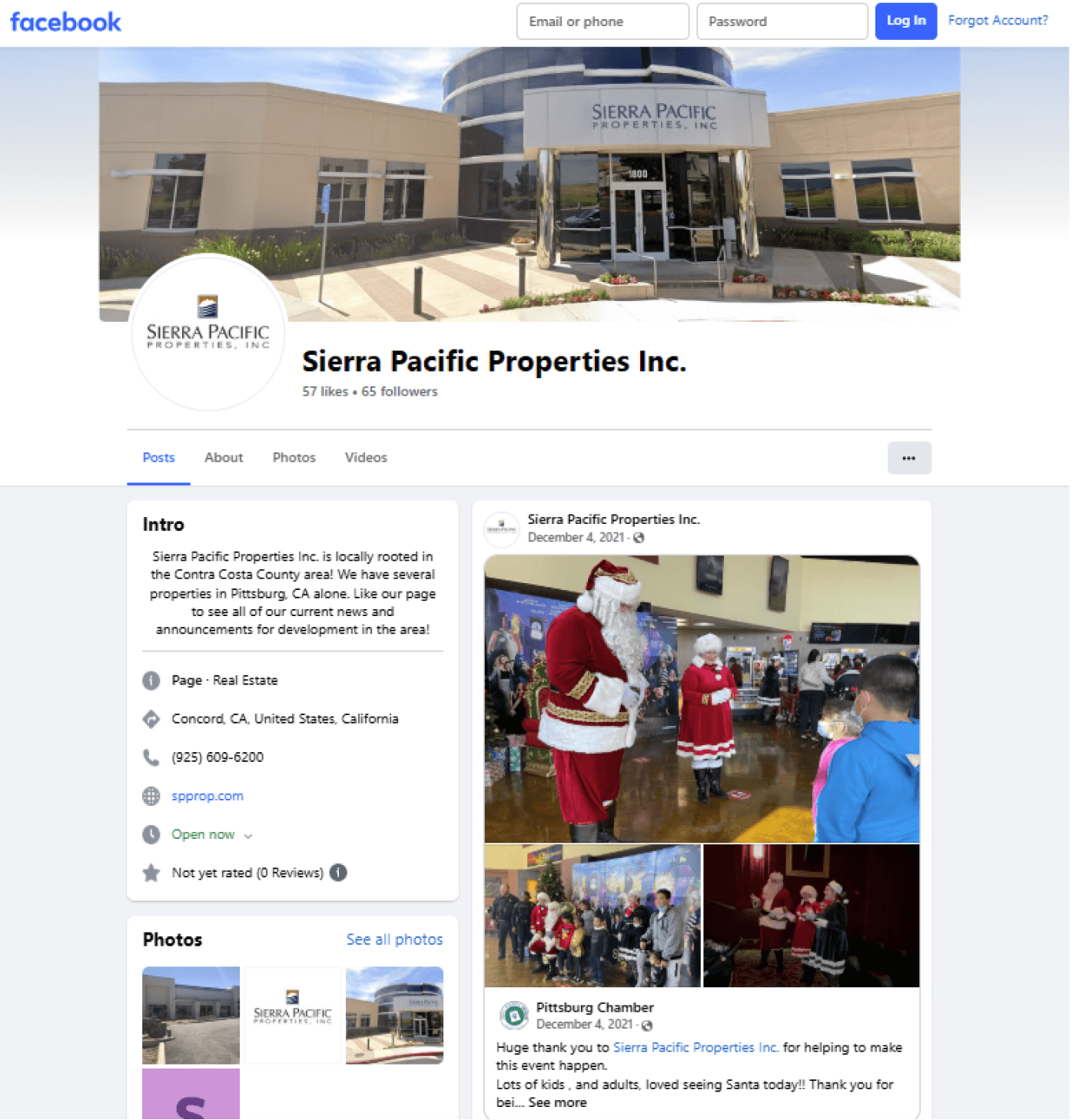
Both LinkedIn and Facebook accounts existed but were inconsistent and low-engagement — used sporadically, with no unified content strategy or visual system connecting them to the main site.
Audit of SPPI's existing website
Both LinkedIn and Facebook accounts existed but were inconsistent and low-engagement — used sporadically, with no unified content strategy or visual system connecting them to the main site.
Competitive analysis of comparable commercial property websites
Both LinkedIn and Facebook accounts existed but were inconsistent and low-engagement — used sporadically, with no unified content strategy or visual system connecting them to the main site.
How We Solved It
01
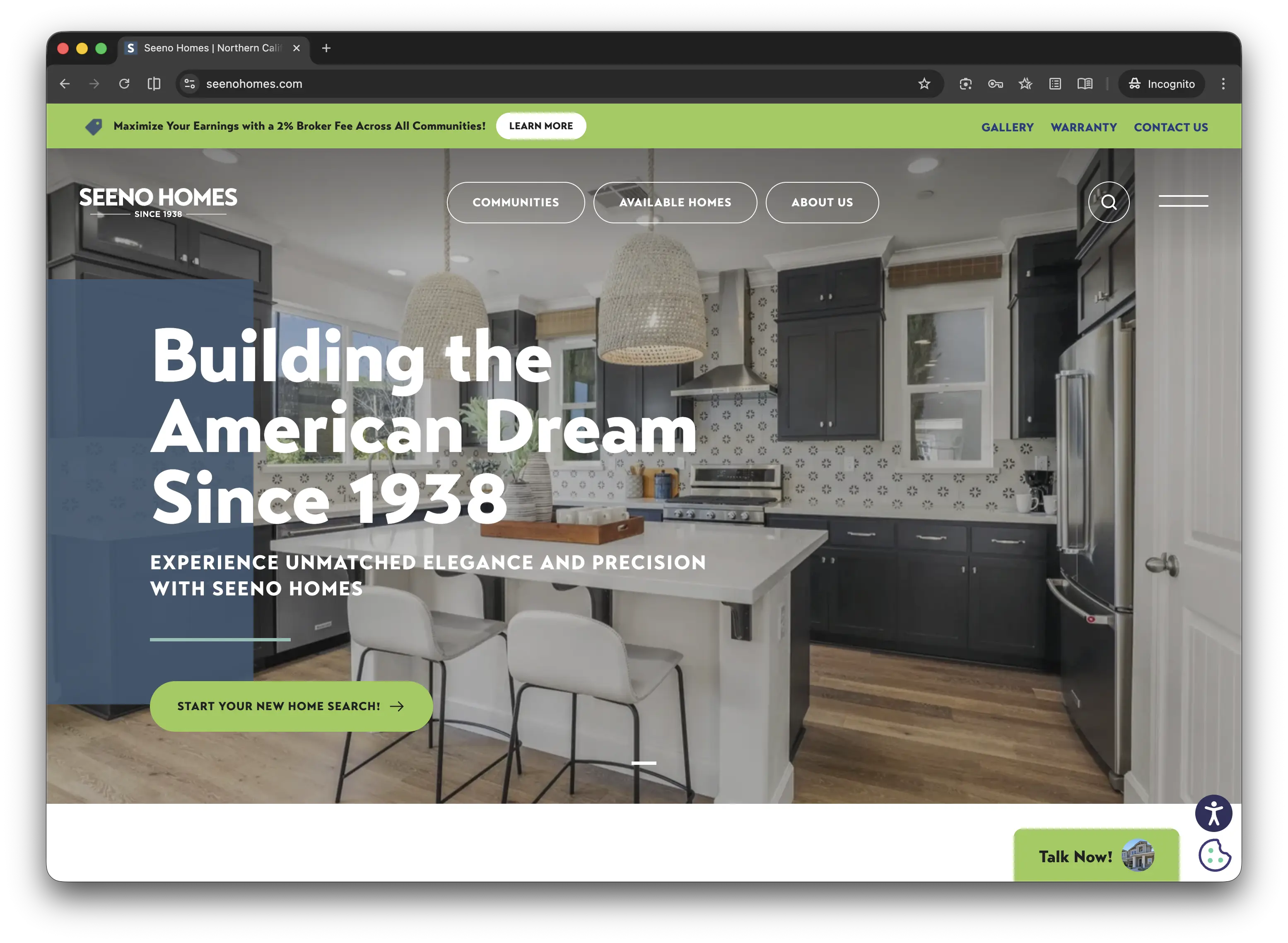
Modernized Branding
Updated logo and branding to continue the legacy branding.
02
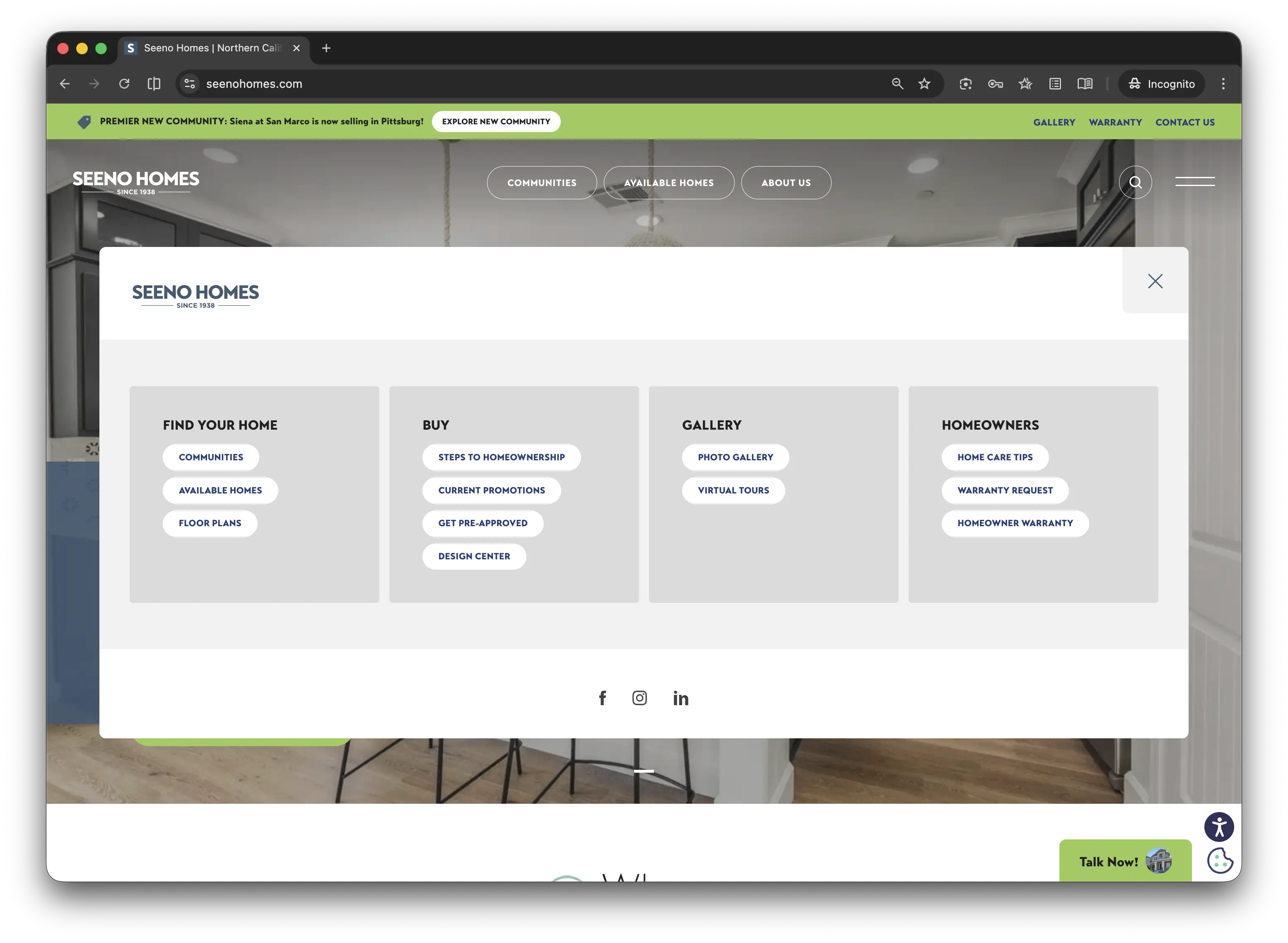
Updated Information Architecture
Updated Information Architecture
03
Live Sales Data
Synchronized four separate sales and listing platforms into the company's first public flow.
Reflections
This project was the first moment it clicked for me what it actually means to go from a contributor to an owner.
When the project lost its structure, I realized no one was coming to save the day. I quickly decided that this was my project to own. I learned how to juggle technical limits with business goals on the fly, and I quickly discovered that I didn't need a fancy title to lead, I just needed to earn people’s trust by consistently showing up and delivering.
My biggest takeaway is that great products don't happen because of a good process. They happen because someone cares enough to take total accountability when it matters most.
What Others Said
"I had the privilege of working closely with Elise on several key initiatives, most notably the buildout of our new website as part of the company’s rebranding efforts. Her leadership, expertise, and dedication have been invaluable to our team. Elise spearheaded the website project with remarkable precision and insight." — New Marketing Manager, Seeno Homes
Our Approach
The website wasn’t supporting how tenants actually searched for available space.
Before making any design decisions, I audited 11 commercial real estate websites across 12 feature categories, ranging from local Bay Area property managers to national REITs like Prologis and Simon Property Group.
The audit revealed a consistent pattern: competitors were investing in digital discovery experiences while SPPI remained difficult to find, explore, and measure online.

01
SPPI was missing industry standard features.
9 of 11 competitors offered interactive property maps, 8 had news sections, and 7 had careers pages. SPPI offered none of them despite managing a large commercial portfolio.
02
We couldn’t measure success.
The site had no analytics, conversion tracking, or SEO infrastructure, making it impossible to understand visitor behavior or business impact.
03
Budget constraints led the strategy
Leadership wanted dedicated pages for every property, but vendor solutions couldn’t support that vision affordably.
Design Decisions
01
Interactive Property Map
I designed an interactive portfolio map that allowed users to explore office, retail, industrial, and residential properties geographically.
02
Scalable Property Landing Pages
I created a reusable landing page system that could support 33 property pages while maintaining consistency and reducing development costs.
03
Direct Contact Pathways
I introduced dedicated department contacts, contact forms, and clear pathways to reach the right team.
Information Architecture
The final website was shaped by information architecture.
Before any design work, I audited 11 competitor websites across 12 feature categories from local Bay Area property managers to large REITs like Prologis and Simon Property Group.
Challenge
The existing website had no clear structure: four flat pages, no dedicated property pages, and no intuitive path for prospective tenants to find space, learn about the company, or contact the right team.
How I handled it
I rebuilt the information architecture around tenant goals rather than internal departments, expanding the site from four flat pages into six structured navigation areas with dedicated pages for properties, team members, news, careers, and contact information.
CHALLENGE 02
I had time to lead the design, but not to see development through to the end. Knowing I'd be departing by summer, I had to choose where to put my energy. Designing the site myself and handing it to a vendor to build and maintain was the only approach that made sense given the timeline, and the only one that didn't leave the company dependent on me once I was gone.
DECISION 02
I designed the full website in Figma before vendor selection, creating interactive prototypes and reusable page templates. The prototype aligned stakeholders, clarified requirements, and became the single source of truth for implementation.
Reflections
This was the first project where I felt fully responsible for the outcome. I experienced the excitement of defining a vision, the uncertainty that comes with navigating competing stakeholder opinions, and the satisfaction of seeing something launch that genuinely impacted the business.
The biggest lesson I took away is that product management isn’t about having the perfect idea, it’s about making thoughtful decisions within real-world constraints. Every major decision on this project involved balancing user needs, business goals, technical limitations, budget, and timeline. Learning how to navigate those tradeoffs ultimately mattered more than any individual design decision.
By the end of the project, I was thinking in terms of systems, ownership, and how to create solutions that could succeed after my involvement ended.
What Others Said
"Elise was able to expertly integrate stakeholder visions, technical considerations, and work as the intermediary driving the development team to ensure that the resulting product not only met but exceeded the designs aspirations of everyone involved…She is exceptionally motivated, endlessly curious, and ultimately committed to the possibility of technology as a tool to improve human experience."
— Sr. Systems Engineer & Administrator, The Seeno Companies
The Problem
Staff have no time to make important decisions…
The project began with a broad challenge: better engage younger audiences, improve customer experience, and support Construction Junction's long-term growth. Through interviews, contextual inquiries, and workflow observations, we discovered the customer experience starts at intake. The quality of online listings, pricing, and product discovery all depended on the quality of information captured there. Rather than adding more technology, we focused on simplifying workflows, improving accessibility, and supporting staff expertise.
"We're getting slammed with pallets of donations…I need to get this item in now, like right now. There's no time to even make a second judgment call."
– Construction Junction Dock Coordinator
Building what’s next for Construction Junction
CJ is a 26 year old, local Pittsburgh nonprofit that gives building materials a second life through affordable resale. Every donated item must be evaluated, priced, photographed, and entered into inventory before reaching customers, making inventory quality foundational to both operations and digital engagement.
My Role
When I first joined the project, their website consisted of a stripped down home page and outdated HTML pages displaying their contact page and property categories. Their portfolio pages were outdated and had inaccurate information displayed. The goal I was positioned with taking over, was to redesign the SPPI website to position the company as a reliable, legitimate, and trustworthy presence in the Northern California commercial property market.
increase in conversion events
increase in organic search sessions
increase in organic engagement rate
Project Metrics
FINDINGS
Competitive analysis of comparable commercial property websites
Both LinkedIn and Facebook accounts existed but were inconsistent and low-engagement — used sporadically, with no unified content strategy or visual system connecting them to the main site.
Legacy systems
Internal sales data had never been integrated into a public-facing platform. Four separate systems needed to talk to each other for the first time.
Compliance requirements
California privacy laws and ADA accessibility standards were non-negotiable constraints that shaped every design and data decision.
Multiple stakeholders
Sales, marketing, and executive leadership all had a seat at the table with different priorities, timelines, and opinions on how the site should work.
Audit of SPPI's existing website
Both LinkedIn and Facebook accounts existed but were inconsistent and low-engagement — used sporadically, with no unified content strategy or visual system connecting them to the main site.
Analytics review of current traffic and user behavior
Both LinkedIn and Facebook accounts existed but were inconsistent and low-engagement — used sporadically, with no unified content strategy or visual system connecting them to the main site.
Reflections
This was the first project where I felt fully responsible for the outcome. I experienced the excitement of defining a vision, the uncertainty that comes with navigating competing stakeholder opinions, and the satisfaction of seeing something launch that genuinely impacted the business.
The biggest lesson I took away is that product management isn’t about having the perfect idea, it’s about making thoughtful decisions within real-world constraints. Every major decision on this project involved balancing user needs, business goals, technical limitations, budget, and timeline. Learning how to navigate those tradeoffs ultimately mattered more than any individual design decision.
By the end of the project, I was thinking in terms of systems, ownership, and how to create solutions that could succeed after my involvement ended.
Design Decisions
Our Approach
The website wasn’t supporting how tenants actually searched for available space.
Before making any design decisions, I audited 11 commercial real estate websites across 12 feature categories, ranging from local Bay Area property managers to national REITs like Prologis and Simon Property Group.
The audit revealed a consistent pattern: competitors were investing in digital discovery experiences while SPPI remained difficult to find, explore, and measure online.
01
01
SPPI was missing industry standard features.
9 of 11 competitors offered interactive property maps, 8 had news sections, and 7 had careers pages. SPPI offered none of them despite managing a large commercial portfolio.
02
We couldn’t measure success.
The site had no analytics, conversion tracking, or SEO infrastructure, making it impossible to understand visitor behavior or business impact.
03
03
Budget constraints led the strategy
Leadership wanted dedicated pages for every property, but vendor solutions couldn’t support that vision affordably.
01
Interactive Property Map
I designed an interactive portfolio map that allowed users to explore office, retail, industrial, and residential properties geographically.
02
Scalable Property Landing Pages
I created a reusable landing page system that could support 33 property pages while maintaining consistency and reducing development costs.
03
Direct Contact Pathways
I introduced dedicated department contacts, contact forms, and clear pathways to reach the right team.
Information Architecture
The final website was shaped by information architecture.
Before any design work, I audited 11 competitor websites across 12 feature categories from local Bay Area property managers to large REITs like Prologis and Simon Property Group.
Challenge
The existing website had no clear structure: four flat pages, no dedicated property pages, and no intuitive path for prospective tenants to find space, learn about the company, or contact the right team.
How I handled it
I rebuilt the information architecture around tenant goals rather than internal departments, expanding the site from four flat pages into six structured navigation areas with dedicated pages for properties, team members, news, careers, and contact information.
CHALLENGE 02
I had time to lead the design, but not to see development through to the end. Knowing I'd be departing by summer, I had to choose where to put my energy. Designing the site myself and handing it to a vendor to build and maintain was the only approach that made sense given the timeline, and the only one that didn't leave the company dependent on me once I was gone.
DECISION 02
I designed the full website in Figma before vendor selection, creating interactive prototypes and reusable page templates. The prototype aligned stakeholders, clarified requirements, and became the single source of truth for implementation.
What Others Said
"Elise was able to expertly integrate stakeholder visions, technical considerations, and work as the intermediary driving the development team to ensure that the resulting product not only met but exceeded the designs aspirations of everyone involved…She is exceptionally motivated, endlessly curious, and ultimately committed to the possibility of technology as a tool to improve human experience."
— Sr. Systems Engineer & Administrator, The Seeno Companies
The Problem
Staff have no time to make important decisions…
The project began with a broad challenge: better engage younger audiences, improve customer experience, and support Construction Junction's long-term growth. Through interviews, contextual inquiries, and workflow observations, we discovered the customer experience starts at intake. The quality of online listings, pricing, and product discovery all depended on the quality of information captured there. Rather than adding more technology, we focused on simplifying workflows, improving accessibility, and supporting staff expertise.
"We're getting slammed with pallets of donations…I need to get this item in now, like right now. There's no time to even make a second judgment call."
– Construction Junction Dock Coordinator